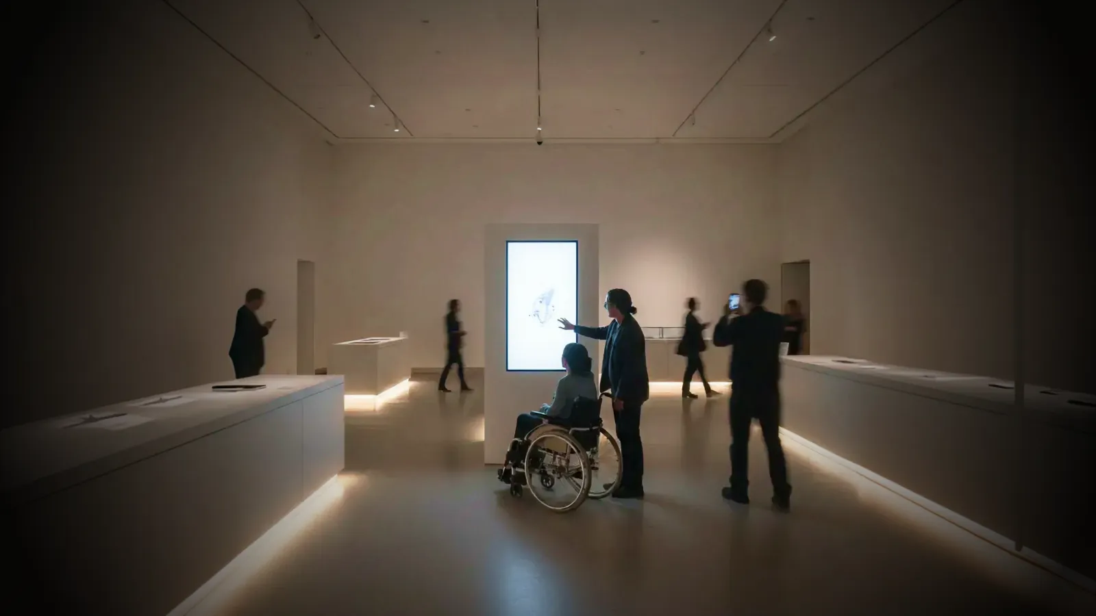
Public museums run by a state or local government now have until April 26, 2027 to make their web content and apps meet WCAG 2.1 AA—or April 26, 2028 if that government has fewer than 50,000 residents or is a special district. DOJ pushed both dates back a year in April 2026, but Title II's duty to communicate effectively with disabled visitors already applies to every kiosk, touch table, and digital exhibit.
But accessibility isn't just about compliance. Accessible design is better design for everyone. The curb cut effect applies to museums: captions help visitors in noisy galleries, high-contrast interfaces work better in varying light, and multiple input methods serve families with children alongside wheelchair users.
This guide covers how to design, specify, and procure accessible interactive installations—whether you're planning a new gallery or retrofitting existing exhibits.
Who this is for: Museum directors, experience designers, exhibit developers, accessibility coordinators, and AV consultants planning interactive installations that serve all visitors.
Key Takeaways
- April 2027 / April 2028: ADA Title II requires WCAG 2.1 AA for state and local government web content and apps—April 26, 2027 for jurisdictions of 50,000+, April 26, 2028 for smaller ones and special districts
- Universal design principle: Remove barriers by design, rather than retrofitting accommodations
- Multi-modal interaction: Provide touch, voice, gesture, and physical button alternatives
- Physical accessibility: Reach ranges, approach clearances, and seated interaction options matter as much as digital accessibility
- Sensory accessibility: Captions, audio description, adjustable contrast, and hearing loops expand your audience
- Cognitive accessibility: Plain language, predictable interactions, and adequate time limits serve everyone
- Testing with diverse users: Involve people with disabilities in prototyping, not just final review
1. The 2026 Compliance Landscape
ADA Title II Requirements
On April 24, 2024, the U.S. Department of Justice published a final rule under Title II of the Americans with Disabilities Act requiring state and local government entities to make their web content and mobile applications accessible.
Key deadlines (extended one year by DOJ's interim final rule of April 20, 2026):
- April 26, 2027: total population 50,000 or more (was April 24, 2026)
- April 26, 2028: under 50,000 and all special district governments (was April 26, 2027)
"Total population" means the census population of the government that runs the museum—for a city museum, the city—not annual visitor numbers. Public libraries run by the same governments face the same dates; see our library installation guide.
The extension only delays the WCAG 2.1 AA deadline; Title II's nondiscrimination and effective-communication duties still apply, and private lawsuits can proceed. The ADA.gov fact sheet on the rule lists the current dates.
The rule's technical standard covers web content and mobile apps and sets no kiosk-specific standard. On-site kiosks, touch tables and digital exhibits are still covered by Title II's effective-communication duty—and browser-based exhibit software can itself be web content—so WCAG 2.1 AA is the defensible benchmark for all of them.
Privately run museums, including nonprofits, fall under ADA Title III instead: DOJ has no Title III rule setting a WCAG standard or deadline, but the same duty to communicate effectively with disabled visitors applies (DOJ web accessibility guidance). This guide describes the rules and is not legal advice—confirm your institution's scope with counsel.
WCAG 2.1 AA Standards
The rule specifies Web Content Accessibility Guidelines (WCAG) 2.1 Level AA as the compliance standard. For interactive installations, this means:
| Requirement | What It Means for Installations |
|---|---|
| Text alternatives | All images, icons, and non-text content need alt text or audio description |
| Captions | Video and audio content requires synchronized captions |
| Keyboard accessible | All functions must work without a touchscreen (for switch users) |
| Contrast ratios | 4.5:1 minimum for normal text, 3:1 for large text |
| Resize text | UI must remain functional when text is enlarged to 200% |
| No seizure triggers | No content flashing more than 3 times per second |
| Consistent navigation | Same controls behave the same way throughout |
What's at Stake
Non-compliance exposes institutions to:
- Legal action: ADA complaints and lawsuits
- Remediation costs: Retrofitting is more expensive than building accessible from the start
- Reputational damage: Accessibility failures become public stories
- Missed audience: an estimated 1.3 billion people—about 1 in 6 worldwide—experience significant disability, according to the World Health Organization; inaccessible exhibits exclude them
2. Universal Design Principles for Interactives
Universal design asks: "How do we design so the barrier never exists in the first place?"
This differs from accommodation, which asks: "How do we help someone after they encounter a barrier?"
The Seven Principles Applied to Museum Interactives
1. Equitable Use The design is useful and marketable to people with diverse abilities.
- In practice: A motion-reactive installation includes a handheld controller option so visitors who cannot make large gestures can still participate fully.
2. Flexibility in Use The design accommodates a wide range of individual preferences and abilities.
- In practice: A touch table offers adjustable text sizes, audio narration, and multiple language options—visitors choose what works for them.
3. Simple and Intuitive Use Use of the design is easy to understand, regardless of experience, knowledge, language skills, or concentration level.
- In practice: Instructions are icon-based with minimal text; the interface works the same way throughout.
4. Perceptible Information The design communicates necessary information effectively, regardless of ambient conditions or the user's sensory abilities.
- In practice: Important information is delivered through visual, auditory, and tactile channels simultaneously.
5. Tolerance for Error The design minimizes hazards and adverse consequences of accidental or unintended actions.
- In practice: The installation confirms before clearing progress; there's always a way to go back.
6. Low Physical Effort The design can be used efficiently and comfortably with minimum fatigue.
- In practice: Touch targets are large; interactions don't require sustained pressure or repetitive motions.
7. Size and Space for Approach and Use Appropriate size and space is provided for approach, reach, manipulation, and use regardless of body size, posture, or mobility.
- In practice: The installation is usable from a wheelchair, by a standing adult, and by a child—all without repositioning the hardware.
3. Physical Accessibility
Digital accessibility gets attention, but physical accessibility determines whether visitors can reach the interface at all.
Reach Ranges and Approach
Forward reach (wheelchair approach):
- Maximum high reach: 48 inches (122 cm) from floor
- Minimum low reach: 15 inches (38 cm) from floor
- Optimal interactive zone: 20–44 inches (51–112 cm)
Side reach (parallel approach):
- Maximum high reach: 48 inches (122 cm) from floor when unobstructed
- Minimum low reach: 15 inches (38 cm) from floor
- Over an obstruction up to 34 inches (86 cm) high: 48 inches (122 cm) maximum for a reach depth up to 10 inches (25 cm), 46 inches (117 cm) maximum for a depth of 10–24 inches (25–61 cm)
Clear floor space:
- Minimum 30 × 48 inches (76 × 122 cm) for wheelchair approach
- Additional space needed for companion or interpreter
Reach limits and clear floor space follow sections 308 and 305 of the 2010 ADA Standards for Accessible Design; the optimal interactive zone is a design recommendation, not a code requirement.
Multi-Height Design
Rather than choosing one height, design for multiple positions:
| User | Optimal Interactive Height |
|---|---|
| Wheelchair user | 28–34 inches (71–86 cm) |
| Standing adult | 42–48 inches (107–122 cm) |
| Child (ages 5–10) | 30–38 inches (76–97 cm) |
Solutions:
- Tilted displays: Angled screens visible from standing and seated positions
- Multi-level stations: Different interaction points at different heights
- Movable interfaces: Tablets on adjustable arms
- Floor-to-ceiling projection: Content spans all heights
For designing across children's age bands (0–3, 4–7, 8–12), see our children's museum installation guide.
Tactile Elements
For visitors with visual impairments, tactile elements provide independent exploration:
- 3D-printed models of artifacts or architectural features
- Tactile maps showing gallery layout and key objects
- Braille labels with audio guide integration
- Texture differentiation to indicate different interface zones
At the Louvre, the Sculpture Discovery Area lets visitors touch casts of artworks, with braille labels and audio narratives alongside—a pattern applicable to any museum context.
4. Sensory Accessibility
Visual Accessibility
Color and Contrast
- Maintain 4.5:1 contrast ratio for normal text (WCAG AA)
- Use 3:1 ratio for large text and graphics
- Never convey information through color alone—add icons, patterns, or labels
Text and Typography
- Minimum 16pt base font size for body text
- Allow text resizing up to 200% without breaking layout
- Use sans-serif fonts for screen readability
- Ensure sufficient line spacing (1.5× recommended)
Visual Alternatives
- Provide audio description for visual content
- Offer screen reader compatibility for kiosk interfaces
- Include high-contrast mode toggle
- Ensure focus indicators are clearly visible
Auditory Accessibility
Captions and Transcripts
- Synchronized captions for all video content
- Transcripts available for audio-only content
- Captions should include speaker identification and sound descriptions
Hearing Loop Systems Install induction loops at:
- Audio stations and listening posts
- Video viewing areas
- Information desks
Visual Alternatives to Audio
- Visual alerts for audio cues
- On-screen text for narration
- Vibration feedback where appropriate
Sensory Sensitivities
Some visitors—particularly those with autism, sensory processing disorders, or anxiety—need lower-stimulation options:
Quiet Modes
- Option to reduce or mute sounds
- Simplified visual displays with reduced motion
- Adjustable brightness controls
Sensory Warnings
- Clear signage before high-stimulation areas
- Preview information about what to expect
- Alternative routes around intense experiences
Calm Spaces
- Designated quiet areas near interactive zones
- Sensory maps showing stimulation levels throughout the gallery
For containing sound in open galleries (directional speakers, zoning) and deciding when silence is the better choice, see our sound design guide.
5. Alternative Input Methods
Touchscreens present barriers for visitors with motor impairments, tremors, or prosthetics. Provide alternatives:
Physical Buttons and Controls
Advantages:
- Work with gloves, prosthetics, and limited dexterity
- Provide tactile feedback
- Familiar interaction pattern
Implementation:
- Large buttons (minimum 0.75 inches / 19mm)
- Sufficient spacing to prevent accidental activation
- Clear tactile differentiation between buttons
- Labels in both visual and braille formats
Voice Control
When it works well:
- Structured commands ("Next," "Select," "Back")
- Quiet gallery environments
- Privacy-appropriate content
Challenges:
- Background noise interference
- Speech impairments may not be recognized
- Not suitable for private interactions
Best practices:
- Offer as one option among several, not the only alternative
- Provide visual confirmation of voice input
- Allow timeout adjustments
Gesture Recognition
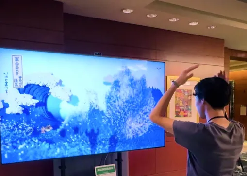
Depth cameras can track gestures for visitors who cannot touch screens:
Accessible gesture design:
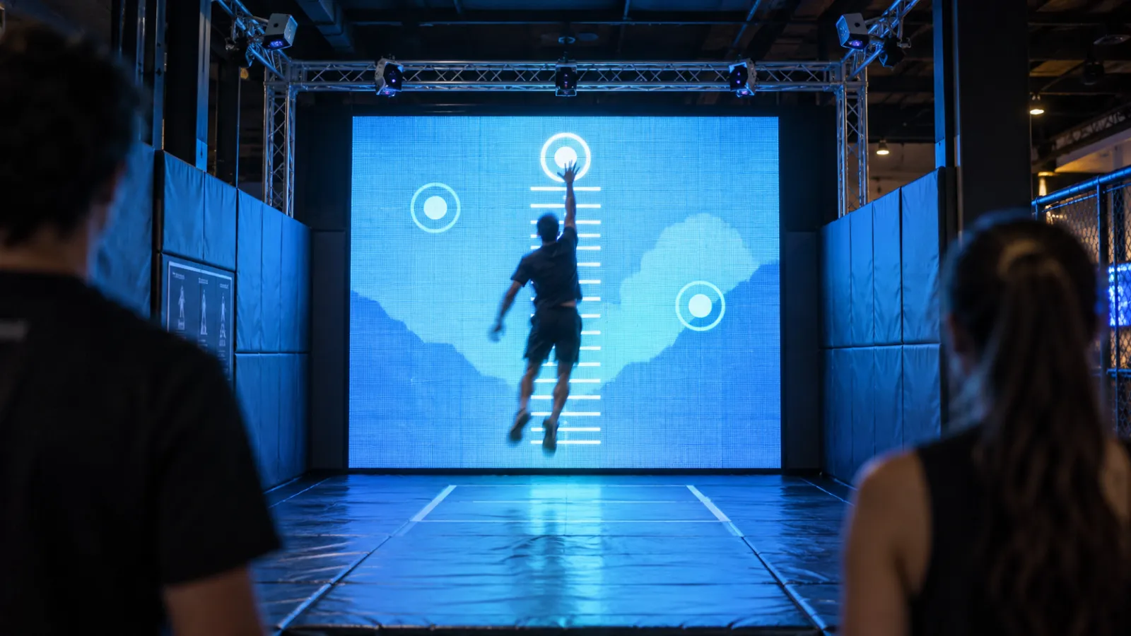
- Large, simple movements (wave, point, swipe)
- Adjustable sensitivity for different ranges of motion
- Visual guides showing the detection zone
- Timeout accommodations for slower movements
QR-to-Mobile
Let visitors control the experience from their personal devices:
Benefits:
- Visitors use their own assistive technologies
- Personal devices already configured for their needs
- Works with screen readers, voice control, and switch access
Implementation:
- QR codes at accessible heights
- Clear instructions in multiple formats
- Mobile interface mirrors kiosk functionality
- Works offline after initial load
Adaptive Controllers
For AR/VR experiences, standard controllers may not work for all visitors:
- Partner with organizations like AbleGamers for adaptive controller guidance
- Offer multiple controller options
- Ensure all features accessible via alternative inputs
6. Cognitive Accessibility
Often overlooked, cognitive accessibility affects the largest number of visitors—including those with learning disabilities, attention differences, age-related cognitive changes, and anyone who's tired, distracted, or unfamiliar with the topic.
Plain Language
- Write at 8th-grade reading level for general audiences
- Define technical terms when first used
- Use short sentences and active voice
- Break complex information into chunks
Predictable Interactions
- Same actions produce same results throughout
- Consistent placement of navigation controls
- Clear indication of current location in the experience
- Obvious way to exit or start over
Error Prevention and Recovery
- Confirm before clearing progress or making irreversible choices
- Provide clear error messages with remediation steps
- Allow undo/back at any point
- Auto-save progress where possible
Time Accommodations
- Allow users to extend or disable time limits
- Don't auto-advance critical content
- Provide pause functionality
- Resume capability if interaction is interrupted
Memory Support
- Don't require visitors to remember information from previous screens
- Show progress indicators
- Provide summaries of completed steps
- Offer save/bookmark functionality for complex experiences
7. Technical Implementation Checklist
WCAG 2.1 AA Compliance for Kiosks
Perceivable
- All images have descriptive alt text
- Video has synchronized captions
- Audio has transcripts available
- Color is not the only means of conveying information
- Contrast ratios meet minimum standards (4.5:1 text, 3:1 graphics)
- Content is resizable to 200% without loss of functionality
Operable
- All functionality available via keyboard/switch
- Focus order is logical
- Focus indicator is clearly visible
- No content flashes more than 3 times per second
- Time limits can be extended or disabled
- Navigation is consistent throughout
Understandable
- Language is identified programmatically
- Instructions don't rely on sensory characteristics alone
- Error messages are clear and helpful
- Input fields have visible labels
Robust
- Works with assistive technologies (screen readers, switches)
- Valid, semantic code structure
- Status messages announced to assistive technologies
Testing Protocol
Automated Testing
- Run accessibility audit tools (axe, WAVE, Lighthouse)
- Check color contrast programmatically
- Validate ARIA implementation
Manual Testing
- Keyboard-only navigation (all functions accessible)
- Screen reader testing (VoiceOver, NVDA, JAWS)
- High-contrast mode verification
- Text resize testing
User Testing
- Include people with disabilities in usability testing
- Test with actual assistive technologies users employ
- Observe diverse user groups (age, ability, language)
- Document and address friction points
Documentation Requirements
- Voluntary Product Accessibility Template (VPAT) for procurement
- Accessibility statement for public display
- Staff training materials on accessibility features
- Maintenance procedures for accessibility components
8. Budget Considerations
Accessibility Costs Less When Built In
Building accessible from the start:
- 5–15% additional design/development time
- Minimal additional hardware costs (buttons, hearing loops)
- Often zero additional software licensing
Retrofitting existing installations:
- 25–50% or more of original project cost
- May require hardware modifications or replacement
- Often results in compromised solutions
What Adds Cost
| Feature | Budget Impact | Notes |
|---|---|---|
| Multi-input support | +$2K–$8K | Physical buttons, voice recognition |
| Hearing loop integration | +$500–$2K per station | Infrastructure may already exist |
| Screen reader compatibility | Minimal if planned | Retrofitting is expensive |
| Tactile elements | +$3K–$15K | 3D printing, custom fabrication |
| Alternative language audio | +$2K–$5K per language | Recording and integration |
| User testing with disabilities | +$2K–$8K | Essential for validation |
To fit these line items into a full project budget, see our interactive installation cost guide, or estimate your exhibit with the interactive museum budget calculator.
ROI of Accessibility
Expanded audience:
- About 1 in 6 people worldwide experience significant disability (WHO)
- Aging population increasingly benefits from accessible design
- Families with strollers use accessible features
- International visitors benefit from visual clarity and multiple languages
Risk mitigation:
- Avoid legal costs from ADA complaints
- Prevent expensive retrofits
- Protect institutional reputation
Grant and funding advantages:
- Many grants require accessibility compliance
- Demonstrates institutional commitment to inclusion
- Supports diversity and inclusion reporting
9. Common Mistakes to Avoid
1. Treating accessibility as a checkbox
- Accessibility is a design mindset, not a feature list
- Build it in from the start; don't add it at the end
2. Assuming compliance equals usability
- Passing WCAG doesn't mean the experience is good
- Test with real users who have disabilities
3. Providing inaccessible "accessible alternatives"
- The alternative must be equally engaging, not a lesser experience
- "Audio tour instead" isn't acceptable if the interactive is the main experience
4. Forgetting physical accessibility
- Digital compliance means nothing if visitors can't reach the interface
- Check reach ranges, approach clearances, and viewing angles
5. Relying on a single input method
- Touch-only excludes many visitors
- Always provide at least two input methods
6. Ignoring cognitive accessibility
- Plain language and predictable design help everyone
- Don't assume visitors share your expertise
7. Not testing with diverse users
- Internal testing misses real-world barriers
- Include people with disabilities early in the design process
8. Setting and forgetting
- Accessibility features break if not maintained
- Include accessibility in daily checks and support contracts
10. About Utsubo
We design interactive installations with accessibility built in from the first sketch. Our approach:
- Discovery includes accessibility audit: We assess your current accessibility baseline and regulatory requirements before proposing solutions
- Universal design principles: Every concept is developed to serve the widest possible audience
- Multi-modal by default: Touch, physical controls, and alternative inputs are part of the standard spec, not add-ons
- Testing with diverse users: We validate designs with people with disabilities during prototyping, not just final QA
Our approach ensures interactive installations meet WCAG 2.1 AA while creating engaging experiences for all visitors.
11. Let's Talk
Planning an accessible interactive installation? We work with museums and cultural institutions to create experiences that welcome all visitors.
If you're exploring a partnership, let's discuss your project:
- Your accessibility requirements and compliance timeline
- Which interaction approaches work for your audience
- Whether we're the right fit to help you execute
Pre-Launch Accessibility Checklist
Physical Access
- Interactive surface within accessible reach range (15–48 inches)
- Clear floor space (30 × 48 inches minimum) for wheelchair approach
- Viewing angles work from seated and standing positions
- Controls operable with one hand, without tight grasp
Visual Access
- Text contrast meets 4.5:1 ratio (AA standard)
- Text resizable to 200% without breaking layout
- High-contrast mode available
- No information conveyed by color alone
- Screen reader compatible
Auditory Access
- All video/audio content captioned
- Hearing loop compatible or alternative provided
- Visual alternatives for all audio cues
- Volume controls available
Motor Access
- Keyboard/switch accessible (no touch required)
- Touch targets minimum 44 × 44 CSS pixels (WCAG 2.1 AAA, SC 2.5.5; the WCAG 2.2 AA minimum is 24×24)
- Time limits adjustable or can be disabled
- At least two input methods available
Cognitive Access
- Plain language (8th-grade reading level)
- Consistent navigation throughout
- Error recovery available at all points
- Progress indicators visible
Testing Complete
- Automated accessibility audit passed
- Manual keyboard testing completed
- Screen reader testing completed
- User testing with people with disabilities completed
FAQs
What are the ADA Title II WCAG deadlines? DOJ's Title II rule requires state and local governments—including the public museums they run—to make web content and mobile apps conform to WCAG 2.1 AA by April 26, 2027 (total population 50,000+) or April 26, 2028 (under 50,000 and special districts). DOJ extended the original 2026/2027 dates by one year on April 20, 2026; Title II's effective-communication duty applies in the meantime.
Does WCAG apply to physical museum installations? Yes, in practice. The rule's WCAG 2.1 AA standard formally covers web content and mobile apps, but every interactive installation a public museum offers falls under Title II's effective-communication duty, and browser-based installations can count as web content. The physical installation must also meet ADA reach and approach requirements.
How much does accessibility add to project cost? When built in from the start, accessibility typically adds 5–15% to design and development time. Retrofitting existing installations can cost 25–50% or more of the original project budget.
What if we can't make an existing installation accessible? Provide an equally effective alternative experience. This might be a guided tour with an educator, a portable accessible device, or an alternative interactive station. The alternative must provide equivalent access to the content, not a lesser experience.
Do we need to provide braille? Braille alone isn't sufficient—most blind visitors don't read braille. Provide audio alternatives (audio description, screen reader compatibility) as the primary accessible format. Add braille for labels and wayfinding where appropriate.
How do we test accessibility? Combine automated tools (for code-level issues), manual testing (keyboard navigation, screen readers), and user testing with people with disabilities. The W3C's Evaluating Web Accessibility resources explain each method, including how to involve users with disabilities.
What's the difference between WCAG 2.1 and 2.2? WCAG 2.2 (released 2023) adds requirements around focus appearance, dragging movements, and accessible authentication. The current ADA rule specifies 2.1 AA, but designing to 2.2 provides a margin of safety and better usability.
Can visitors sue if our installation isn't accessible? Yes. ADA Title II violations can result in complaints to the Department of Justice, civil rights lawsuits, and consent decrees requiring remediation. Legal costs often exceed what accessibility would have cost to build in.


 Interactive Installations for Museums