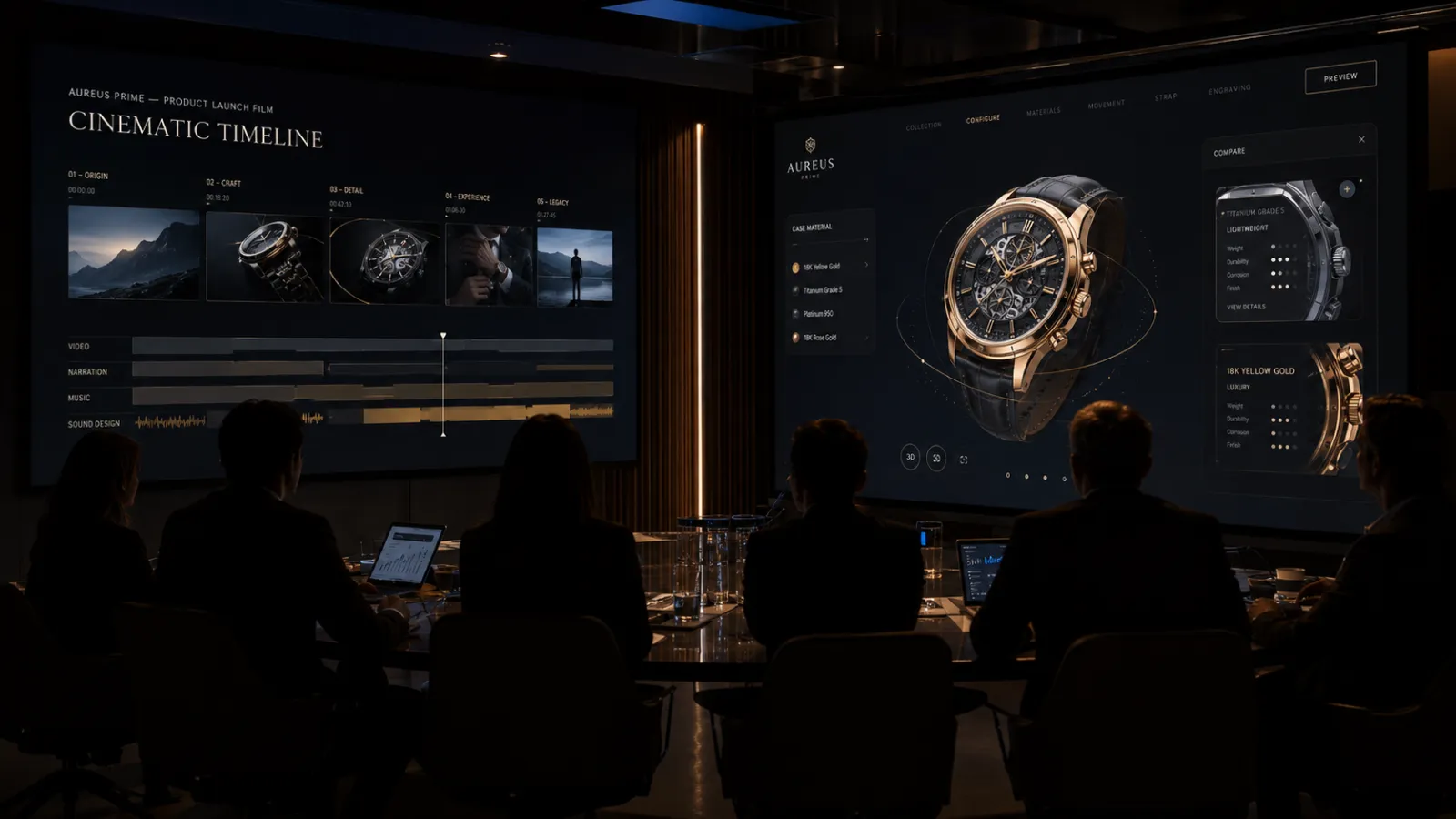
A launch video is the easiest thing to approve. It has a storyboard, a deadline, a clean deliverable, and an obvious place in the campaign plan. It gives sales, PR, paid media, and executives something to point at. For many product launches, video is still necessary.
The mistake is treating video as the whole experience.
For a high-consideration product, the video creates the first impression, but the website is where the buyer starts testing the claim. Can I understand the product? Can I compare options? Can I see how it works in my context? Can I share the experience internally? Can I trust the company behind it? A passive asset can make someone interested. An interactive website can turn that interest into confidence.
This article is for teams deciding whether the next product-launch budget should go almost entirely into film, or whether some of it should be reserved for a beautiful interactive website: a product story users can explore, manipulate, configure, compare, and return to after the campaign impression is gone.
Who this is for: Founders, CMOs, brand leads, product marketers, and launch owners deciding how to split budget between video production and an interactive product website for a launch, rebrand, flagship campaign, or premium product reveal.
Key Takeaways
- Do not frame this as video vs. website. Frame it as attention vs. decision support. Video is strong at attention and emotion; an interactive website is stronger at exploration, proof, comparison, and conversion measurement.
- The best evidence does not say "more interactivity is always better." The Springer-linked study found that better website experiences required fewer clicks, fewer page changes, less time, and produced higher subjective usability scores. Good interactivity reduces wasted effort.
- Interactivity helps when it removes buyer friction. Useful interaction lets the user rotate a product, configure a variant, compare options, calculate fit, reveal proof, or understand a workflow. Decorative animation is not the same thing.
- Sales evidence is strongest when the interaction directly supports purchase confidence. Research on click behavior shows website interactions can predict purchase intent; e-commerce eye-tracking research links visual complexity and cognitive load to customer perception. That is not a universal conversion-lift guarantee, so serious teams should A/B test.
- Brand memory is not only made by what people watch. It is also made by what they do. A user who actively explores a product story is building a richer mental model than someone who watches the same cutdown as everyone else.
- A practical launch split: keep video for reach, but reserve budget for the site when the product is expensive, complex, configurable, visually differentiated, or strategically important to the brand.
1. The Launch Budget Trap
Most launch plans overfund the moment of exposure and underfund the moment of evaluation.
That is understandable. A video looks like the launch. It can open the keynote, run in paid social, sit on YouTube, feed PR, and give leadership a concrete artifact. A website often looks like infrastructure: necessary, but less glamorous.
But buyers do not make high-value decisions inside the video player.
They watch, then they search. They click through. They skim. They compare. They forward the page to a colleague. They come back from mobile. They look for evidence that the promise is real. They try to understand whether this product is for them or for someone else.
If all the budget went into the film, the site often becomes a thin landing page: hero video, three claims, a form, maybe a few static renders. That is fine for a simple campaign. It is weak for a product where understanding drives the sale.
The useful question is not:
"Should we make a video or a website?"
It is:
"After someone becomes interested, what experience gives them enough confidence to act?"
Sometimes the answer is still a video-heavy page. For many launches, though, the answer is a smaller video budget plus a stronger interactive site.
2. What Interactivity Actually Means Here
Interactivity does not mean adding motion everywhere. It does not mean a loading screen, a cursor effect, or a 3D object that spins without purpose.
For a product-launch website, interactivity means the user can do something that improves understanding.
| Interaction | What it helps the user answer |
|---|---|
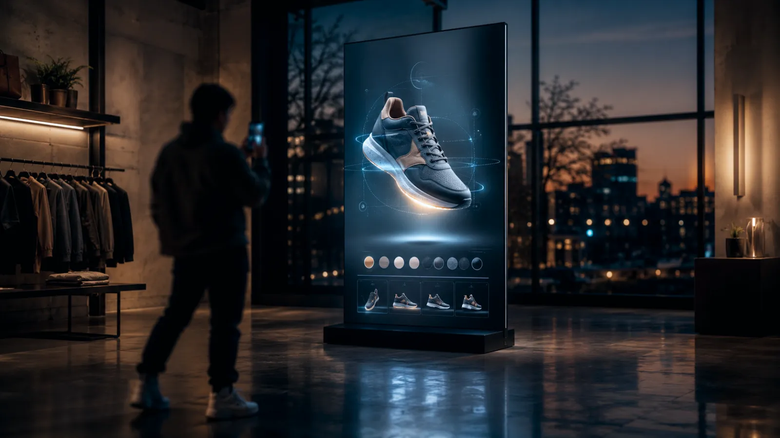
| 3D product viewer | What does this actually look like from every angle? |
| Configurator | What does my version look like, and what changes when I choose options? |
| Scroll-driven product story | How does this product work, step by step? |
| Interactive comparison | Which model, plan, or use case is right for me? |
| ROI / fit calculator | Does this make economic sense for my situation? |
| Interactive demo / simulation | What happens when I use it? |
| Shoppable or lead-gen product scene | Can I move from interest to action without losing the context? |
Good interactivity has a job. It reduces ambiguity. It lets the user test the promise. It gives the brand a memorable behavior, not just a memorable image.
Decorative interaction can still be valuable for atmosphere, but it should not be sold internally as ROI. The business case is stronger when the interaction maps to a real buyer friction: "I cannot picture it," "I do not understand how it works," "I need to compare options," "I need to justify this internally," or "I need to trust that this is premium."
3. What the Research Actually Supports
There is a lot of lazy writing around interactive websites: "more engagement," "more immersion," "more conversion." The research is more useful than that, because it is more specific.
3-1. Better UX often means less wasted interaction
The paper you linked, User Interaction Analysis through Contrasting Websites Experience, compares user behavior across contrasting website sets using subjective usability scores, eye gaze, interaction data, and facial emotion analysis. The open arXiv version is also available here.
The useful business reading is not "make everything more interactive." It is almost the opposite.
In the study, the better-performing website set had a much higher average SUS score: 77.8 vs. 48.0. It also required about 30% less interaction across duration, visited scenes, and clicks. The authors interpret this as a sign that more efficient interaction corresponds to better user perception. Eye-gaze data also suggested users focused more on relevant areas with less visual interference.
For a launch website, that matters. Interactivity should not make the user work harder. It should make the product easier to understand with less wasted motion.
3-2. Emotion and usability are linked
The same study found that the poorer website set tended toward more negative valence/arousal patterns, while the better set showed more positive emotion and engagement patterns. This is not a sales study, and it should not be treated like one. But it supports a practical point every launch team has felt: friction is emotional.
When a site is confusing, cluttered, slow, or unrewarding, users do not simply "fail to convert." They feel the brand is harder to trust.
3-3. Cognitive load matters in e-commerce
A 2026 eye-tracking paper, A Study of Consumers Cognitive Load in eCommerce Websites using Eye-tracking Technology, studied 48 participants and measured cognitive load through fixation count, saccades, fixation duration, and task completion time. Its abstract is careful but relevant: aesthetics influence purchasing decisions and satisfaction, and webpage complexity / high cognitive load are responsible for unpleasant shopping experiences.
This is the line launch teams should pay attention to: beautiful does not mean ornamental. Beautiful means the buyer can think clearly.
3-4. Interaction behavior is commercially meaningful
In User-click Modelling for Predicting Purchase Intent, Simone Borg Bruun studied business-website click behavior as a way to predict purchase intent. The thesis found that purchase intention depends heavily on how users navigate: how many pages they visit, what kinds of pages they interact with, and how much time they spend. The click-based models significantly outperformed a demographic model.
That does not prove that adding an interactive product story automatically increases sales. It proves something more operationally useful: the way users interact with the website is a meaningful commercial signal. If the launch site is only a passive video wrapper, you are leaving a lot of buyer-intent data and decision support unexplored.
3-5. First impression is fast, but the decision is slower
The classic Lindgaard study, summarized by Wired, found that people can form visual judgments about a website in roughly 50 milliseconds. That supports investing in the opening visual system: art direction, motion, typography, product imagery, and a first screen that feels premium.
But a first impression is not a purchase. The role of the interactive site is to carry the user from "this feels interesting" to "I understand why this matters."
4. Where Video Wins
Video is not the enemy. It is often the best tool for the top of the launch funnel.
Use video when the job is:
- Reach - paid social, YouTube, PR embeds, sales decks, retail screens, investor updates.
- Emotional compression - a 60-second piece can create mood faster than a website section.
- Executive alignment - video gives internal teams a shared narrative.
- Product theater - reveal, atmosphere, music, pacing, scale, human context.
- Repeatable distribution - the same asset can be cut into teasers, launch clips, ads, and event content.
If the audience does not yet know the product exists, video is efficient. It interrupts. It frames. It gives the launch a voice.
The problem starts when the video is asked to do the whole job: awareness, education, proof, comparison, configuration, lead capture, and conversion. That is too much weight for one asset.
Put simply: a video maximizes brand control; an interactive product experience maximizes user agency. For some luxury launches, control matters more. For configurable, technical, contextual, or identity-driven products, agency can be the thing that makes the buyer care.
5. Where an Interactive Website Wins
An interactive launch website wins when the buyer needs to explore before they believe.
5-1. Complex products need manipulable explanation
If the product has a workflow, system architecture, physical mechanism, AI process, material story, or before/after transformation, a passive video can introduce it. But a website can let the user move through it at their own pace.
That matters because buyers do not all have the same question.
The CFO wants ROI. The technical lead wants feasibility. The brand lead wants differentiation. The operator wants implementation. A linear video forces them through the same order. An interactive site lets each person pull the thread that matters to them.
5-2. Configurable products need live choice
If the product comes in variants, plans, finishes, sizes, modules, locations, or use cases, do not make the buyer imagine the difference from static copy.
Show it.
A configurator, comparison tool, or interactive selector turns the product from a claim into a decision surface. It also gives sales and marketing better data: which configurations users explore, where they hesitate, and which variants create action.
5-3. Premium products need proof of craft
A polished launch film can make a brand feel premium. A polished interactive website can make the product feel premium under inspection.
For high-end goods, technical products, luxury hospitality, advanced hardware, real-time 3D, AI products, architecture, mobility, and design-led SaaS, the website is often the place where the buyer checks whether the craft survives contact. Materials, motion, microcopy, responsiveness, and interaction quality all become brand signals.
Cheap interactivity hurts here. But thoughtful interactivity is powerful because the user is not just seeing the brand's taste. They are touching it.
5-4. B2B launches need shareable proof
In B2B, the person who loves the launch video is often not the final decision-maker. They need to forward something to procurement, finance, IT, leadership, or a client.
An interactive website can become the internal artifact:
- a calculator with assumptions,
- a comparison table,
- a technical section,
- a downloadable spec,
- a case-story path,
- a short interactive demo,
- a bookmarked configuration.
That is difficult for video to do alone.
6. The Budget Split: A Practical Decision Table
Use this table before the launch budget gets locked.
| Product / launch condition | Better budget bias |
|---|---|
| Simple product, low price, clear use case | More video / static landing page |
| High price or long sales cycle | Keep video, invest in interactive website |
| Product has variants, modules, plans, or configurations | Strong interactive budget |
| Product value is mostly emotional or lifestyle-led | Strong video, polished site |
| Product is technical or hard to explain | Interactive explainer + shorter video |
| Product is visually differentiated | 3D / interactive product story |
| Launch goal is PR reach | Video-heavy, but do not neglect landing experience |
| Launch goal is conversion, demo requests, pre-orders, or sales enablement | Website-heavy |
| Audience is mostly mobile and low-intent | Lightweight interaction only |
| Audience is high-intent and researching | Interactive proof, comparison, and CTA paths |
The simplest rule:
If the launch needs attention, video carries more weight. If the launch needs understanding, the website carries more weight. If the product is strategically important, fund both but make them do different jobs.
7. A Sensible Launch Architecture
For most serious launches, the strongest system is not a cinematic video sitting above a generic page. It is a coordinated stack.
7-1. The hero video: short, emotional, reusable
Make the video tight. It should establish the product world, tone, and promise. It should be reusable in paid, social, sales, and events. It does not need to explain everything.
7-2. The interactive hero: the user touches the promise
Immediately after the emotional opening, give the user an action: rotate the product, scrub through the mechanism, choose a use case, reveal the system, configure the offer, or move through the scene.
This is where the launch stops being a broadcast and becomes an experience.
7-3. The proof layer: claims become inspectable
Use the page to make proof navigable:
- specs,
- comparisons,
- integration diagrams,
- materials,
- performance numbers,
- testimonials,
- product states,
- implementation steps,
- pricing or ROI assumptions where appropriate.
The proof layer should not feel like a PDF pasted under a film. It should feel like the natural next step after the user becomes interested.
7-4. The conversion layer: action without context loss
Do not send users from a beautiful product story into a generic form with no memory of what they explored. If the user configured a product, chose a use case, or interacted with a calculator, carry that context into the CTA.
That might mean:
- "Book a demo for this use case,"
- "Send us this configuration,"
- "Get pricing for this setup,"
- "Download the technical spec,"
- "Talk to us about this launch format."
The interaction should shorten the path to the right conversation.
8. How to Measure Whether It Worked
Do not justify an interactive website with vague engagement language. Measure the behavior that matters.
8-1. Pre-launch baseline
Before launch, capture:
- current conversion rate by landing page,
- demo / inquiry / pre-order rate,
- paid campaign landing-page performance,
- scroll depth and key content engagement,
- average engagement time,
- mobile performance,
- branded search and direct traffic,
- sales-team qualitative objections.
For a broader measurement model, see the website redesign ROI guide.
8-2. Launch-site metrics
For the interactive site, track:
| Metric | Why it matters |
|---|---|
| Interaction start rate | Are users interested enough to touch the experience? |
| Interaction completion / depth | Do they reach the proof, not just the opening effect? |
| CTA rate after interaction | Does interaction correlate with action? |
| Segmented conversion | Compare users who interacted vs. users who did not. |
| Mobile drop-off | Detect when the experience is too heavy. |
| Return visits | A useful signal for considered products and internal sharing. |
| Configuration / use-case choices | Sales intelligence for follow-up and product positioning. |
The key is not "time on page went up." A user can spend more time because they are delighted, or because they are confused. Pair time with completion, CTA rate, and qualitative feedback.
8-3. A/B test where possible
The honest test is simple:
- Version A: strong video-led landing page.
- Version B: video plus interactive decision-support experience.
- Same traffic source.
- Same CTA.
- Same measurement window.
Measure conversion, lead quality, sales acceptance, average order value or pipeline value, and return visits. If the product is e-commerce, also measure return rate. If the product is B2B, measure whether sales conversations start with more context.
If the interactive version only increases browsing but not action, it may be beautiful but commercially weak. If it raises qualified actions or reduces repeated sales explanations, it is doing real work.
9. When Not to Spend on an Interactive Website
There are launches where a simple site and a strong video are the right choice.
Do not overbuild the website when:
- The product is easy to understand in one image. A beautiful product page may be enough.
- The audience is very low-intent. Heavy interaction can become friction.
- The campaign window is too short. If the site will be used for two weeks and never again, keep the build lean.
- You cannot fund performance. A slow interactive site is worse than a static one.
- The interactivity has no buyer job. If nobody can explain what question it helps answer, cut it.
- You do not have traffic or a distribution plan. An interactive site without visitors is a portfolio piece, not a launch asset.
The goal is not to make every launch immersive. The goal is to spend enough on the website when the website is where confidence gets built.
10. Budget Ranges
Interactive launch websites do not always need to sit at the top of the premium-web ladder. A few years ago, browser-based 3D often meant a heavy custom build, specialist rendering work, and a budget that only made sense for flagship campaigns. That is changing. Better web rendering, reusable 3D pipelines, Gaussian splatting, pre-baked motion sequences, and smarter performance patterns make it possible to deliver cinematic product moments at smaller launch budgets - as long as the interaction is focused.
For detailed cost logic across broader website scopes, see the premium website cost guide. For launch-specific work, a more realistic planning ladder is:
| Scope | Typical range | Best fit |
|---|---|---|
| Video-led landing page with light interaction | $10K-$15K | Simple launch, strong campaign asset, polished but mostly linear page |
| Interactive product story | $20K-$60K | Scroll-driven story, 3D product moment, use-case selector, proof sections, strong mobile performance |
| Product experience / configurator | $60K-$120K | Configurator, WebGL / WebGPU, interactive demo, multiple user paths, analytics strategy, campaign integration |
On top of that, custom 3D asset creation, product capture, complex configurator rules, multilingual content, and campaign content production can change the number significantly. The biggest cost difference is usually whether the project needs a fully custom real-time world, or whether it can use a focused cinematic technique: pre-rendered motion with interactive control, a single optimized 3D product moment, a scroll-driven splat scene, or a constrained configurator.
A useful planning split for a serious launch:
- 40-60% video / content production if reach and PR are the dominant goal.
- 40-60% interactive website if conversion, product understanding, sales enablement, or premium brand perception are the dominant goal.
- Do not starve performance engineering. If the interactive site is slow on real phones, the budget was misallocated.
These are planning heuristics, not universal rules. The right split depends on product complexity, audience intent, media plan, and how long the launch site will remain useful after launch week.
11. About Utsubo
Utsubo is a creative-technology studio specializing in real-time 3D websites, interactive product stories, and launch experiences. We build the kind of web work that sits between brand film, product demo, and performance engineering: cinematic enough to carry a launch, but structured enough to support real buyer decisions.
Our work includes WebGL and WebGPU brand experiences, 3D product storytelling, interactive retail experiences, and high-performance sites where motion and conversion have to coexist. We are also working on newer production techniques that bring video-like motion quality, 3D depth, and user-controlled interaction closer together on the web - so a launch site can feel cinematic without becoming a six-figure custom engine every time.
We care about the same thing this article argues for: interactivity with a job. Not more effects. More clarity, more confidence, and a better reason for the user to act.
If your next product launch needs to feel premium and help buyers understand the product, the website should not be the leftover line item after the video is paid for.
12. Let's Talk
Planning a product launch and deciding how much budget belongs in video versus the website?
We can help you scope:
- what the launch video should do,
- what the website should do differently,
- which interaction actually supports the buyer journey,
- how to measure the result after launch,
- whether a lightweight or full interactive build makes sense.
13. Checklist
- Defined the launch objective: awareness, conversion, sales enablement, brand repositioning, or product education
- Listed the buyer questions a video cannot answer alone
- Identified whether the product is complex, configurable, premium, visual, or high-consideration
- Decided which interaction has a real buyer job
- Kept video focused on attention, emotion, and distribution
- Designed the site for exploration, proof, comparison, and action
- Planned mobile performance and fallback states before production
- Defined interaction analytics before launch
- Built a baseline for conversion and engagement metrics
- Planned an A/B test or post-launch comparison window
- Gave sales a way to use the interactive site in follow-up conversations
FAQs
Should we spend more on a launch video or an interactive website?
Spend more on video if the main goal is reach, PR, paid social, or emotional awareness. Spend more on the interactive website if the product is expensive, complex, configurable, technical, premium, or needs buyer education before action. For strategic launches, the best answer is usually both, with clear roles: video creates attention; the website builds confidence.
Does an interactive website increase sales?
It can, but only when the interaction removes a real purchase friction. Research supports the commercial importance of website interaction behavior and the link between usability, cognitive load, and customer perception. That is not the same as a guaranteed sales lift. The right way to prove it is to A/B test the interactive experience against a strong video-led page and measure conversion, lead quality, order value, return visits, and returns where relevant.
What kind of interactivity works best for a product launch?
The best format depends on the product. Use a 3D viewer when users need to inspect form and detail. Use a configurator when choices matter. Use scroll-driven storytelling when the product process is hard to explain. Use calculators or selectors when the buyer needs to justify fit or ROI. Avoid interaction that only exists to look modern.
Can a video do the same job as an interactive site?
Video is better at controlling emotion and pacing. It is weaker at letting users explore their own questions. A buyer can watch a video, but they cannot configure it, compare inside it, calculate with it, or send a specific explored state to a colleague. That is where an interactive website adds value.
How much should an interactive launch website cost?
A polished video-led landing page with light interaction can sit around $10K-$15K. A deeper interactive product story is commonly $20K-$60K. A product experience or configurator with 3D, demos, analytics, and campaign integration can reach $60K-$120K. Custom 3D, multilingual content, and production complexity can change the budget.
What is the biggest mistake teams make with interactive launch sites?
They fund visual novelty but not decision support. A launch site can be beautiful and still fail if the interaction does not help the buyer understand, compare, trust, or act. The second mistake is underfunding mobile performance. A slow interactive site turns craft into friction.
Should the interactive website replace the launch video?
Usually no. The stronger move is to let each asset do its job. Use video for reach and emotional framing. Use the interactive site for exploration, proof, personalization, and conversion. Replacing one with the other is less useful than designing the launch system around how buyers actually move from attention to decision.
How do we measure brand recognition from an interactive website?
Track branded search, direct traffic, return visits, social sharing, qualitative recall in customer interviews, sales-team feedback, and campaign-lift studies if the media budget supports them. For brand recognition specifically, do not rely only on engagement time. Measure whether people remember the product, return to it, and describe the brand in the intended language.


 Technology-First Creative Studio