A field guide to the real design language — from the density paradox to ma — and how to commission it.
Japanese web design is not one aesthetic. It runs from an extraordinarily dense, information-maximal commercial web — Rakuten, Yahoo! Japan, Kakaku.com — to an internationally awarded minimal tradition built on ma (間), the charged negative space at the heart of Japanese art. Most English-language writing flattens this into "Japanese design is minimal." It often isn't. Knowing which Japan you actually want is the first decision to make before you brief a single screen.
This guide decodes the design language with real examples: why so many Japanese sites pack the screen, where restraint and ma genuinely live, how vertical text and three simultaneous scripts shape layout, why Japanese type historically looked "system-default," and how a brand borrows the look without sliding into cherry-blossom cliché.
Who this is for: Brand directors, marketing leads, and founders evaluating a Japanese-influenced or bilingual site — what the aesthetic actually is, and how to commission it well. This is not a developer tutorial.
Key Takeaways
- "Japanese web design is minimalist" is a Western projection. The domestic commercial web is frequently the opposite — dense, link-rich, and information-maximal — and that density is a deliberate, effective response to its audience.
- There are two poles, not one style. Mass-market/domestic sites lean dense and high-trust; premium, craft, and global-facing sites lean spare and ma-driven. Your brand has to pick a position on that spectrum.
- Ma (間) is not "whitespace." It's the active, intentional interval that gives an element weight. It signals premium, craft, and calm — which is why luxury, hospitality, and museum sites use it.
- Typography is the deepest differentiator. Vertical writing (縦書き), the simultaneous mixing of kanji, hiragana, katakana, and Latin, and strict line-breaking rules create rhythm and hierarchy that Latin-only typography can't reproduce.
- There's a technical reason older Japanese sites look the way they do. A Japanese font needs ~7,000–10,000+ glyphs versus a few hundred for Latin, so for years sites shipped text-as-images or system fonts. Subsetting and Noto/dynamic webfont services changed that.
- The look is a commission decision, not a template. Borrowed well, it's restraint and type discipline; borrowed badly, it's decorative tropes bolted onto a Western layout.
1. The Myth: "Japanese Design Is Minimal"
Ask a Western designer to picture "Japanese design" and you'll usually get the same image: empty space, natural materials, a single object placed with monastic care. That picture is real — but it comes from product and spatial design (MUJI, traditional architecture, the vocabulary of wabi-sabi), not from the everyday Japanese web.
Open the homepage of a major Japanese portal and you'll often find the opposite: dozens of links, stacked banners, ranking widgets, fine print, and color used to flag urgency. To an eye trained on Silicon Valley minimalism it can read as cluttered. It isn't. It's a different design tradition solving a different problem for a different audience — and confusing the two is the single most common mistake brands make when they ask for a "Japanese look."
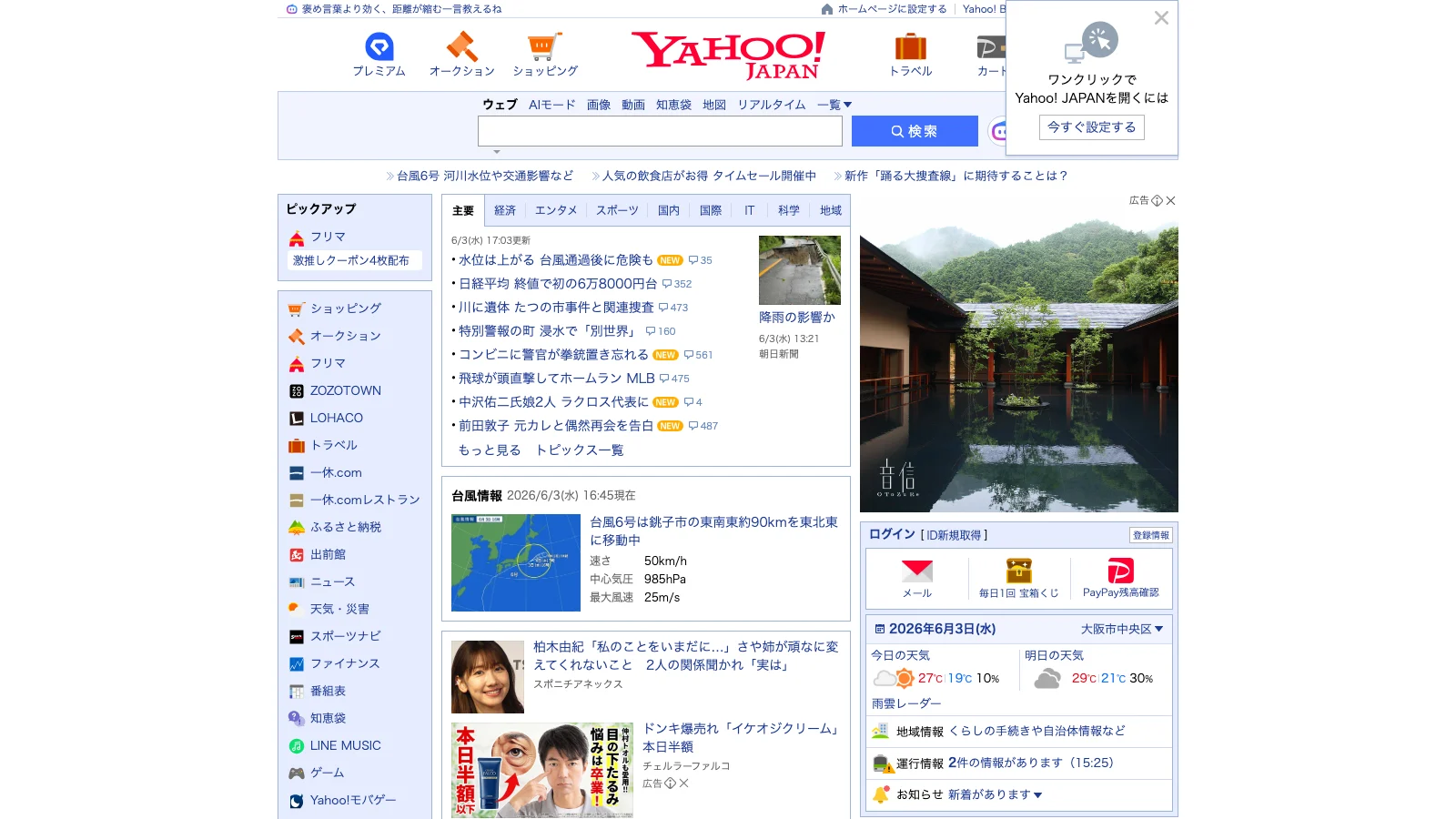
The portal above — Yahoo! Japan — is a fair representative of one whole tradition. The truth is that Japanese web design occupies a wide spectrum, and the two ends look almost nothing alike. The rest of this guide maps that spectrum so you can place your own project on it deliberately.
2. The Density Paradox: Why Japanese Sites Pack the Screen
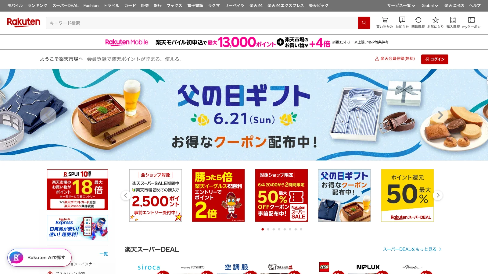
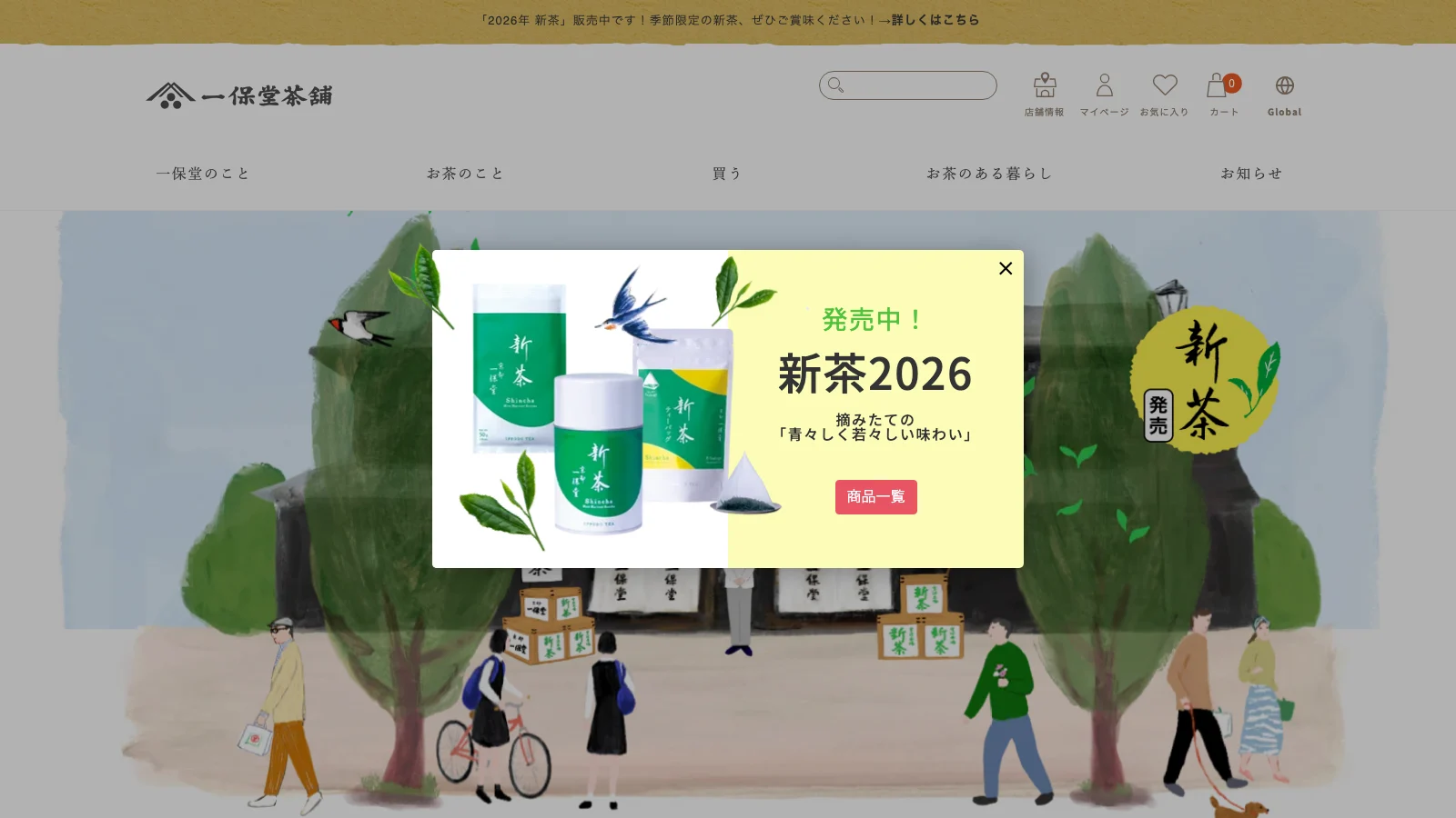
The most distinctive — and most misunderstood — trait of the Japanese commercial web is information density. Sites like Rakuten, Yahoo! Japan, and the price-comparison giant Kakaku.com deliberately surface enormous amounts of information on a single screen: navigation, categories, rankings, promotions, reviews, and fine print all competing for attention.
This is not a failure to "clean up." It's a coherent response to several forces at once:
- Information equals trust. In a risk-averse purchasing culture, more visible detail — specs, prices, conditions, seller ratings, return terms — reads as transparency and reassurance. A sparse page can feel like it's hiding something.
- Kanji is information-dense by nature. A single kanji carries a whole concept, so a Japanese line communicates more per character than its English equivalent. The same screen real estate simply holds more meaning.
- Mobile and feature-phone heritage. Japan's i-mode era trained users to scan compact, link-heavy menus, and that scannability habit carried into the desktop and smartphone web.
- Portal and SEO legacy. Decades of portal-style navigation and keyword-rich, link-dense pages shaped both user expectation and search behavior.
- Choice as a service. Showing the full range up front — rather than progressively revealing it — respects a shopper who wants to compare exhaustively before committing.
For a brand, the lesson is not "copy the clutter." It's that density is a legitimate, audience-appropriate choice — and if you're selling to a domestic Japanese mass-market audience, a spare Western layout may actually underperform a richer one.
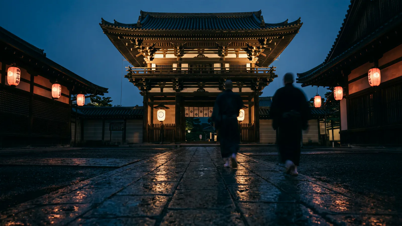
3. Ma (間): Negative Space in the Premium & Craft Web
The other pole is where the Western stereotype is actually true — and it rests on a concept that doesn't translate cleanly: ma (間).
Ma is usually rendered as "negative space," but that undersells it. Ma is the active, charged interval between things — the pause that gives a sound its rhythm, the gap that gives an object its presence. In design, ma isn't empty leftover space; it's a deliberate element doing as much work as anything printed on the page. Space is the design.
On the web, ma shows up wherever the brief is about restraint, quality, and calm rather than volume and choice:
- Luxury and fashion houses, where a single image and generous margin signal exclusivity.
- Hospitality — ryokan, hotels, and resorts selling a feeling of space and quiet.
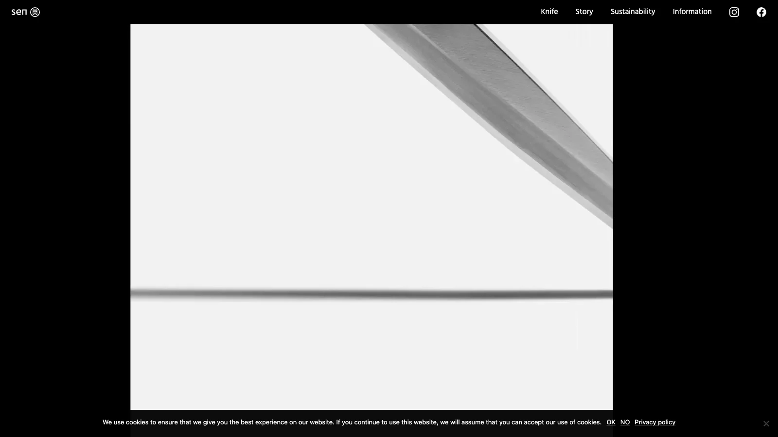
- Craft, heritage, and shokunin brands — sake breweries, ceramics, knife-makers — where the product is slowness and care.
- Museums and cultural institutions, where the design steps back so the work can breathe.
- Award-winning studios' own sites, which use ma and motion to demonstrate taste.
This is the register most non-Japanese brands actually mean when they ask for a "Japanese aesthetic" — and it's the register Japanese studios win Awwwards and FWA awards in. It's the polar opposite of §2, and both are authentically Japanese. The difference isn't sophistication; it's audience.
4. Reading the Two Poles: A Density Spectrum
Most real Japanese sites sit somewhere between the two poles, dialed to their audience and sector. Use this as a placement tool: where does your brand actually belong?
| Dimension | Mass-market / domestic pole | Premium / global-facing pole |
|---|---|---|
| Information density | High — many links, banners, rankings | Low — one idea per view |
| Ma / negative space | Minimal; space is "wasted" inventory | Central; space carries meaning |
| Color | High-saturation, red "sale" grammar | Restrained; heritage or monochrome palette |
| Motion | Functional, modest | Expressive, scroll-driven, crafted |
| Typography | Dense gothic (sans), small sizes | Mincho (serif) or refined gothic, generous leading |
| English-readiness | Often Japanese-first | Frequently bilingual or English-capable |
| Typical sector | EC, portals, news, services | Luxury, hospitality, craft, culture, brand |
Neither column is "better." A depachika food-hall promotion and a ryokan booking site are both doing Japanese web design correctly — for opposite audiences. The mistake is importing one pole's rules into the other's brief.
5. Typography I — Vertical Writing & The Three Scripts
Typography is where Japanese web design is least like the Western web — and it's the part most foreign teams underestimate.
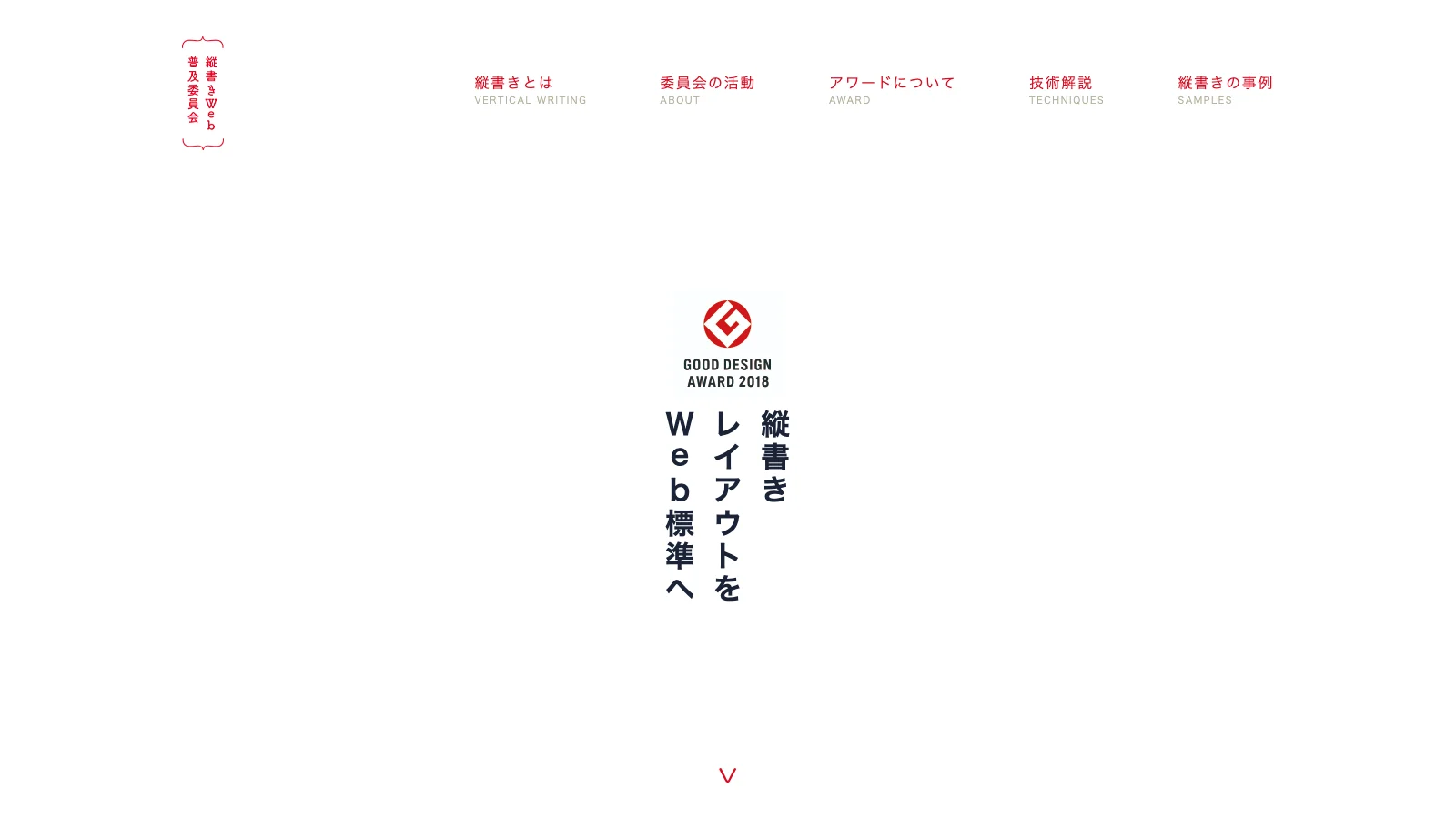
Vertical writing (縦書き, tategaki). Japanese can be set top-to-bottom, right-to-left — the traditional orientation of books, newspapers, and literature. On the web it's set with CSS writing-mode, and it still appears in editorial, literary, luxury, and culturally-rooted sites where it signals heritage and craft. Horizontal setting (横書き, yokogaki) dominates UI and most commercial pages, but a brand that uses vertical text well instantly reads as distinctly, intentionally Japanese.
Three scripts at once. A single Japanese sentence routinely mixes kanji (logographic), hiragana (rounded, grammatical), and katakana (angular, used for loanwords and emphasis) — plus Latin letters and Arabic numerals. These scripts have different visual textures, and skilled typography uses that contrast to build rhythm and hierarchy within a single line — something Latin-only typography simply can't do.
Rules Western type doesn't have. Japanese has no spaces between words, so line-breaking relies on character-level logic and kinsoku shori (禁則処理) — rules forbidding certain characters (small kana, closing brackets, punctuation) from starting or ending a line. Ruby text (furigana) — tiny pronunciation glosses above kanji — adds another typographic layer. Get these wrong and the page reads as foreign-made; get them right and it reads as native.
6. Typography II — Web Fonts & Why Japanese Sites Looked "System-Default"
Here's the technical reality that explains why so many older Japanese sites look the way they do — and almost no English design article mentions it.
A Latin web font ships a few hundred glyphs. A Japanese font needs roughly 7,000–10,000+ glyphs to cover the kanji in common use, the two kana sets, punctuation, and symbols. For years, that made Japanese web fonts enormous — multi-megabyte files that were impractical to load. The workarounds defined an era: sites set headlines and even body copy as images, or fell back to whatever system fonts the user's OS provided. That's a major reason a lot of the Japanese web has historically looked uniform and "default."
What changed: subsetting (shipping only the glyphs a page actually uses), dynamic subsetting services (Adobe Fonts, Morisawa's TypeSquare, FONTPLUS, Google Fonts' Japanese support), high-quality open families like Noto Sans JP / Noto Serif JP, and variable fonts. Custom Japanese web typography is now genuinely feasible — but it still carries cost and performance trade-offs you should brief for, not assume.
The one distinction every commissioner should know: mincho (明朝) is the serif-like style — high-contrast strokes, editorial, traditional, calm — while gothic (ゴシック) is the sans-serif style — even strokes, modern, legible, the default for UI. Choosing between them is the Japanese equivalent of choosing serif vs. sans, and it sets the entire tone of a site.
7. Color, Texture & Seasonality
Color in Japanese design splits along the same spectrum as everything else.
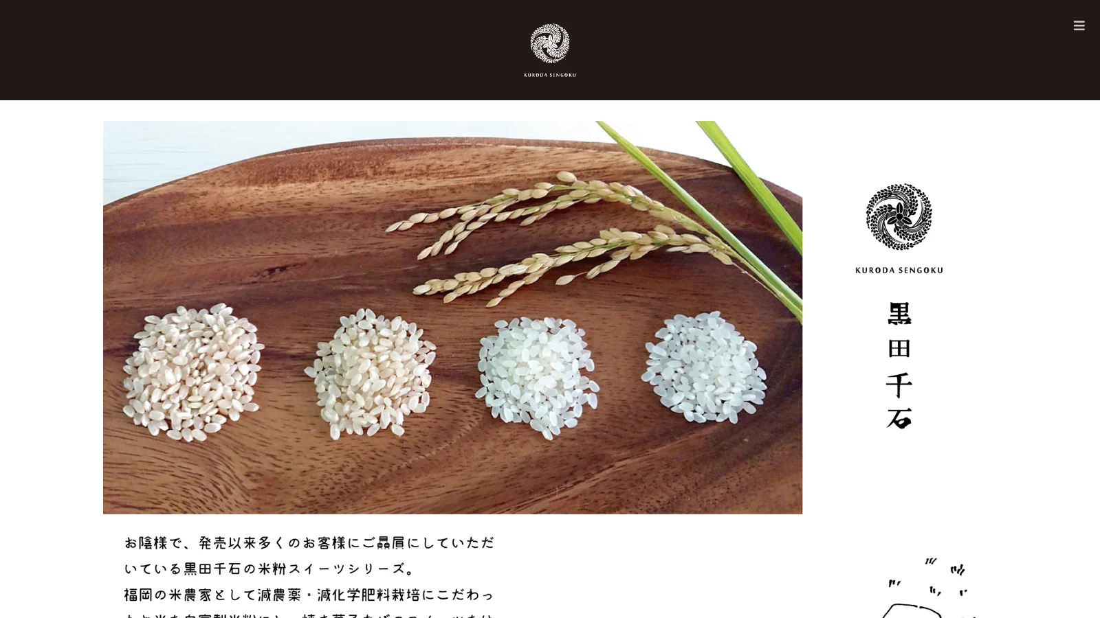
At the premium/craft pole, the palette draws on a traditional vocabulary: indigo (藍), vermilion (朱), sumi ink black, the warm off-white of washi paper, muted earth tones, and gold leaf as a restrained accent. These colors carry centuries of association and instantly read as refined and rooted.
At the mass-market pole, color is functional and high-saturation — reds and yellows that flag sales, urgency, and "new," a visual grammar shoppers parse instantly.
Cutting across both is seasonality (季節感) — a genuinely Japanese sensibility. Sites and campaigns shift with the calendar: cherry blossoms in spring, deep reds and golds in autumn, seasonal product and color refreshes timed to cultural rhythm. For consumer-facing work this isn't decoration; it's expected, and it's closely tied to how Japanese brands stage moments throughout the year — a thread we pick up in our guide to designing pop-ups for Japanese consumers.
8. Layout & UX Conventions
Beyond density and type, a cluster of layout habits make Japanese sites feel Japanese — and feel "off" to Western eyes until you understand the audience:
- Comprehensive global navigation and mega-menus that expose the full site map rather than hiding it behind progressive disclosure.
- Persistent sidebars and rails carrying categories, rankings, and promotions.
- Badges and ribbons — NEW, 限定 (limited), 送料無料 (free shipping) — used liberally to flag status and urgency.
- Vertical banners and tall promotional blocks, a format that suits stacked Japanese text.
- Table-heavy comparison and spec pages, because thorough comparison is part of the buying ritual.
- Deliberate line-break control for readability, since there are no word spaces to break on naturally.
- Mobile- and LINE-centric patterns — Japan is heavily mobile, and LINE is woven into how brands communicate and convert.
None of this is accidental. Each pattern serves an audience that values thoroughness, reassurance, and scannability — and a site aimed at that audience should adopt the patterns on purpose, not "fix" them.
9. Motion, Interaction & the Awwwards Tradition
If there's one area where Japanese studios lead the global field, it's craft motion and interaction — and this is not new. Rewind to the Flash era (roughly 2000–2010), when Adobe Flash let designers build animated, interactive, sound-driven experiences the plain HTML web couldn't touch. Japanese studios dominated it: pioneers like Yugo Nakamura (yugop / tha ltd.), FromArpil, and Group Inc. set the global creative bar, racking up FWA and Cannes recognition and defining what an "experience" website could be. When Flash died — killed by the iPhone's refusal to support it and the rise of open web standards — that whole experimental tradition went quiet for years.
It's back. WebGL, Three.js, and now WebGPU have given the open web the expressive power Flash once had, and the same Japanese sensibility has returned to the frontier: scroll-driven storytelling, precise micro-interaction, and ambitious real-time 3D — restraint and spectacle held in careful balance.
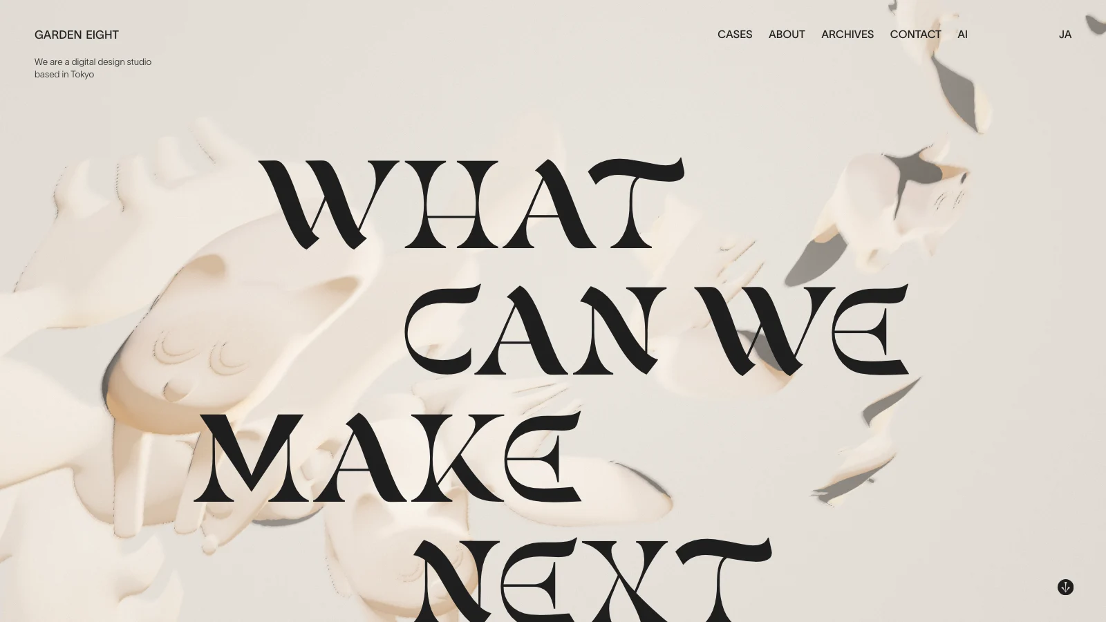
This is the tradition that wins Awwwards, FWA, and CSS Design Awards year after year — studios like SHIFTBRAIN, mount, Garden Eight, monopo, the experimental work of Rhizomatiks, and our own studio, Utsubo. It's also the register where the ma sensibility and technical excellence meet: motion used not to decorate but to pace, reveal, and give weight. (For the broader craft of narrative, motion-led sites, see our guide to immersive storytelling websites.)
It's the same engineering-led, performance-aware approach we bring to WebGL and WebGPU builds at Utsubo — craft motion that still loads fast and ranks. If you want this calibre of work, the studios worth briefing are largely the ones with a serious motion and 3D portfolio.
10. Choosing Your Pole: Authentic vs. Cargo-Cult Japanese
The fastest way to make a "Japanese-inspired" site look cheap is to treat the aesthetic as a sticker pack: cherry blossoms, a torii gate, a brush-stroke font, and the word "zen" — bolted onto an otherwise Western layout. That's cargo-cult Japanese, and Japanese audiences spot it instantly.
Authentic borrowing works at the level of principles, not motifs:
- Restraint over decoration. Earn attention with ma and hierarchy, not ornament.
- Type discipline. Get the script mixing, leading, and line-breaking right; respect mincho vs. gothic tone.
- Ma where it counts. Use space deliberately, as an element — not as a default "clean" gesture.
- Match the pole to the audience. Selling to Japan? Lean toward density, thoroughness, and trust signals. Evoking Japan for a global audience? Lean toward ma, craft, and quiet.
That last question — who is this actually for — should drive every other decision. Use the prompt below to pin it down before you brief anyone.
My context:
- Brand: [what you sell, positioning, price point]
- Primary audience: [domestic Japanese mass-market / Japanese premium / global audience evoking Japan / bilingual]
- Goal of the site: [sell, book, build prestige, generate leads, tell a story]
- Competitors or references I admire: [list]
Help me:
- Place my brand on the density ↔ ma spectrum and justify it.
- Recommend an information-density level, a color approach (heritage vs. commercial), and mincho vs. gothic typography for my tone.
- Flag where I'm at risk of "cargo-cult" Japanese clichés, and what to do instead.
- List what I should include in a brief to a studio to get this right.
11. Commissioning a Japanese-Influenced Site
Once you know your pole, briefing gets concrete. A good brief for a Japanese-influenced or bilingual site names:
- Your pole on the spectrum (§4) — dense/domestic vs. spare/ma-driven — with reference sites.
- Typography ambitions — vertical text? mincho or gothic? custom Japanese web font (with its cost/performance trade-off) or a high-quality open family like Noto?
- Language scope — Japanese-only, English-only-evoking-Japan, or a true bilingual JP-EN build (which affects layout, type, and content workflow).
- Motion level — functional, or the scroll-driven craft motion of §9.
- Audience and conversion context — domestic trust signals and LINE, or a global brand experience.
Budget tracks scope and craft, not nationality — the same bands as any premium custom site (see our premium website cost guide for the full breakdown). The bigger variable is studio selection: doing this well — real ma, correct typography, motion that performs — is a craft most generic agencies fumble. It's worth briefing a studio with genuine Japanese design fluency and a serious engineering portfolio.
Let's Talk
If you're considering a Japanese-influenced or bilingual brand site, we can help you place it on the spectrum and build it with the typography, ma, and motion the aesthetic actually demands.
A good first conversation usually covers:
- Your audience and pole — are you selling to Japan, or evoking Japan for a global audience?
- Typography and language scope — vertical text, mincho vs. gothic, and whether it's a true bilingual build.
- Craft and performance — the level of motion and 3D you want, delivered fast enough to rank.
Book a 30-minute call to talk through your brief. We'll help scope the work and tell you honestly which pole your project belongs to.
FAQs
Is Japanese web design minimalist or dense? Both — it's a spectrum. The domestic commercial web (EC, portals, news) is often very dense, surfacing many links, rankings, and promotions because, in a risk-averse purchasing culture, visible detail reads as trust. The premium, craft, and global-facing web is minimal, built on ma (negative space). Which one is "right" depends entirely on your audience, not on sophistication.
What is ma (間) in design?Ma is the active, intentional interval — the charged space between elements — not merely leftover "whitespace." In Japanese aesthetics, that space is itself a design element that gives the things around it weight and rhythm. On the web it shows up in luxury, hospitality, craft, and cultural sites where restraint signals quality.
Why do many Japanese websites look so text- and information-heavy? Several reasons converge: information equals trust in a thorough, risk-averse buying culture; kanji is information-dense per character, so a line says more; the i-mode/feature-phone era trained users to scan link-heavy layouts; and portal/SEO legacy shaped expectations. The density is a deliberate, audience-appropriate choice, not a lack of polish.
What is vertical text (縦書き) and when is it used on the web?Tategaki is Japanese set top-to-bottom, right-to-left — the traditional orientation of books and newspapers. On the web it's produced with CSS writing-mode and appears in editorial, literary, luxury, and heritage-oriented sites, where it signals craft and cultural rootedness. Most UI and commercial pages still use horizontal setting (yokogaki).
Why did Japanese websites historically use images instead of web fonts? Because a Japanese font needs roughly 7,000–10,000+ glyphs versus a few hundred for Latin, so early Japanese web fonts were impractically large. Designers set text as images or relied on system fonts — which is why much of the older Japanese web looks uniform. Subsetting, dynamic webfont services, Noto Sans/Serif JP, and variable fonts have since made custom Japanese typography feasible.
Can a non-Japanese brand use a Japanese aesthetic without it looking like a cliché? Yes — by borrowing principles, not motifs. Restraint, correct typography, and deliberate ma read as authentic; cherry-blossoms-and-"zen" decoration bolted onto a Western layout reads as cargo-cult. The key is matching your design choices to your audience: lean dense and trust-driven to sell to Japan, lean ma and craft to evoke Japan for a global audience.
How much does a Japanese-influenced custom website cost? It costs the same as any premium custom site of comparable scope — nationality isn't the price driver; craft, motion, language scope, and custom typography are. Bilingual JP-EN builds and custom Japanese web fonts add cost. See our premium website cost guide for full budget bands.
Mincho or gothic — which Japanese typeface style should I use?Mincho (明朝) is the serif-like style — high stroke contrast, editorial, traditional, calm — ideal for heritage, luxury, and long-form. Gothic (ゴシック) is the sans-serif style — even strokes, modern, highly legible — the default for UI and most commercial sites. Choose by tone, exactly as you'd choose serif vs. sans in Latin typography.
 Technology-First Creative Studio